When Typography Becomes the Illustration
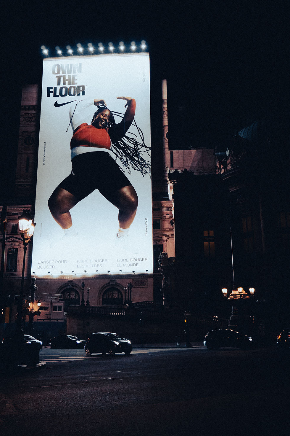
Typography doesn't always have to sit next to an image. Sometimes the typography is the image.
This is one of my favorite approaches to type because it gives designers a chance to experiment. Letters can be stretched, repeated, rotated, warped, overlapped, cropped, or arranged into completely new shapes. At that point, the viewer isn't only reading the word—they're experiencing it visually.
Scale can make a huge difference. An oversized letter extending beyond the edge of a poster can become an abstract shape. Repeating one word dozens of times can create texture. Overlapping letters can create depth without using traditional illustration.
The challenge is finding the balance between readability and experimentation. If everything is perfectly readable, the design might feel too safe. But if the letters are manipulated too much, the message can disappear completely.
I think the most interesting experimental typography sits somewhere between those two extremes. You recognize that you're looking at language, but you also see shapes, rhythm, movement, and composition.


Comments