Typography in Sports Design: Why Everything Feels So Bold
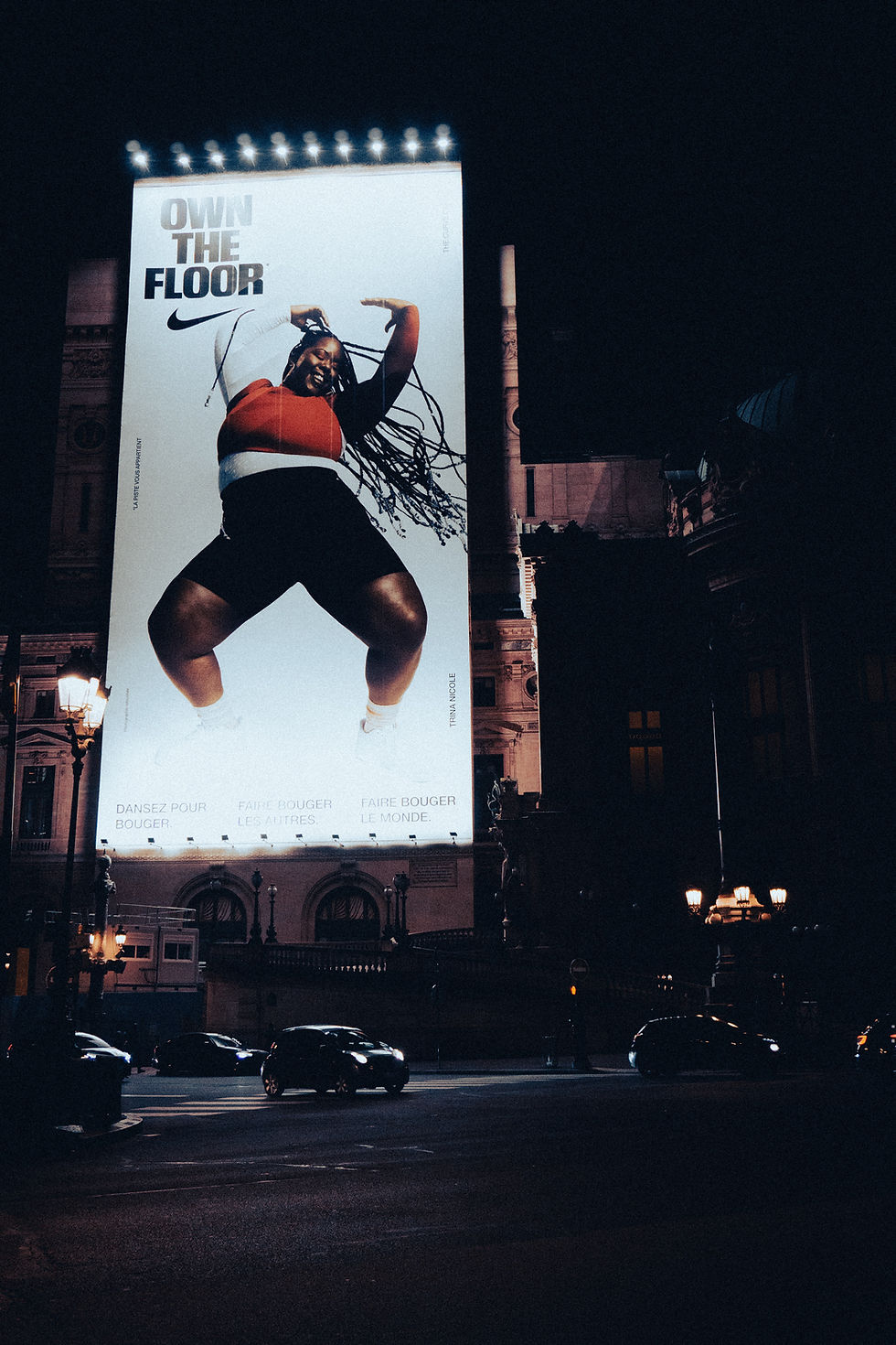
Sports design is one of my favorite places to look for typography because type usually needs to communicate energy almost instantly.
Think about graphics for football, basketball, or soccer. The typography is often large, bold, condensed, italicized, or tightly spaced. These choices create a sense of movement, strength, competition, and urgency.
Hierarchy is especially important in sports graphics. A player's name or final score might take up most of the composition, while secondary information is much smaller. That extreme difference in scale helps viewers understand the information quickly, which is especially important on social media.
Designers also manipulate type instead of simply typing something and leaving it alone. Letters might be stretched, outlined, layered behind players, cropped by the edge of the composition, or combined with textures and motion effects.
This is something I want to explore more in my own work because I'm interested in sports media and content creation. Sports typography shows how type can become an active visual element instead of simply delivering information.
Visual idea: Design a fictional game-day graphic using a huge condensed headline, oversized numbers, team colors, and smaller supporting information.


Comments