Typography Is Everywhere: A Day of Looking at Type
One thing typography classes have changed for me is how I look at everyday life. Once you start paying attention to type, it becomes almost impossible to stop noticing it.
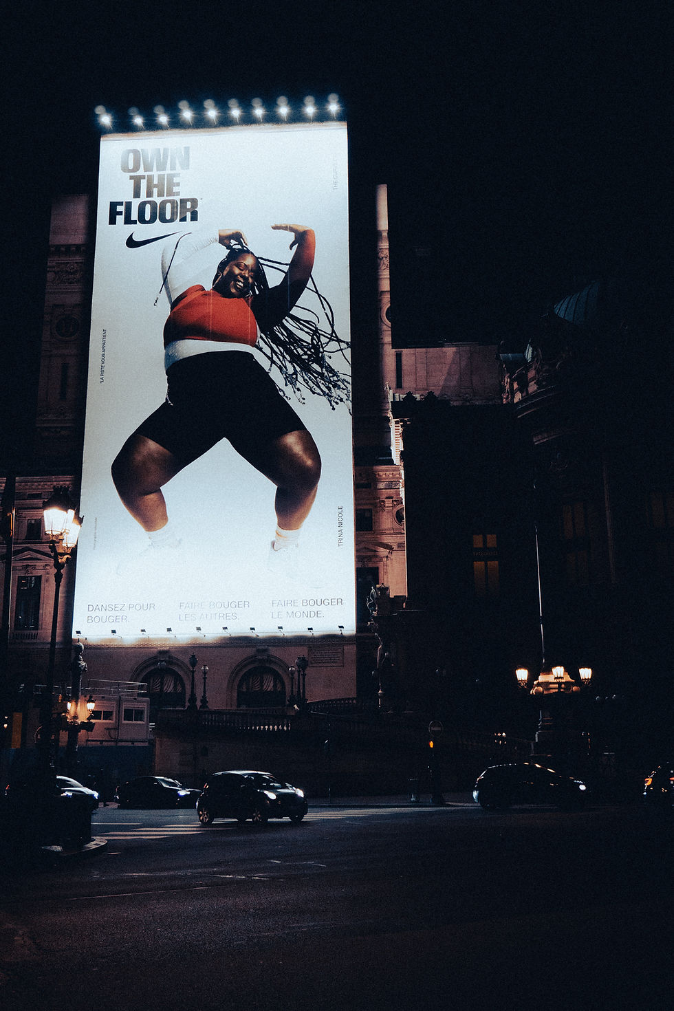
Typography is everywhere: street signs, menus, clothing, food packaging, phone apps, advertisements, receipts, license plates, storefronts, and even warning labels.
What makes this interesting is that each example has a different job. A highway sign needs to be readable within seconds from a distance. A restaurant menu needs to organize a lot of information without becoming overwhelming. Product packaging needs to communicate information while also competing for attention on a shelf.
These examples show that typography isn't only about choosing a cool font. Designers have to think about legibility, hierarchy, contrast, scale, spacing, audience, and environment.
For this post, I challenged myself to pay more attention to typography around me instead of only looking at design inspiration online. It made me realize that some of the best typography lessons are already around us, we just have to actually look.


Comments