Typography at the Movies: How Type Sets the Mood Before the Film Begin
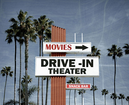
Before a movie even starts, typography is already telling us what kind of experience we're about to have.
Movie posters and title sequences use type to communicate genre, mood, and personality. Horror movies might use distorted or irregular lettering to create discomfort. A futuristic science-fiction movie might use geometric sans serif typography with wide tracking. A romantic drama could use a more elegant serif or handwritten typeface.
What interests me is how much information we understand without consciously thinking about it. If the typography on a horror poster looked like the typography from a children's movie, something would immediately feel wrong.
Typography can also become part of a movie's identity. Sometimes the title treatment becomes so recognizable that seeing the lettering alone is enough to remind you of the movie.
As a designer, this reminds me that choosing a font shouldn't just be about what looks good. The typeface needs to support thproject's emotion and messagect. Typography isn't decoration added at the end, it is part of the storytelling.


Comments